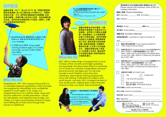
The reason why I’ve been MIA for the past week is because I’ve been busy rearranging text, translating and refining my people cutting skills on Photoshop. I’m proud to say that I finally figured out an easy way to cut out hair without it looking too unnatural thanks to this blog post!
I’m pretty much happy with my final product, except that the brochure may be lacking a bit of the “wow factor.” We are still trying to figure out what that may be. And is it just me, or do the fact boxes look more aqua than light blue to you? Because on my Photoshop screen, it is definitely light blue. It is just when I upload it onto the web that it seems to look different. Could it be because I used the CMYK color scheme instead of RGB? I’m told that if I want it printed out, I should use CMYK….
But yes, other than that, any thoughts on the “wow factor”?


ladylike said:
Probably the colour doesn’t match? or either too many words?
Just my two cents 🙂
Good luck in your product!
Tiffany said:
wow thats so cool that you work for the KELY organization? they came to our school once to give motivational talks
Barneys Girl said:
Ladylike: Yeah, the color is a bit off. On my screen though, the aqua/green color is more of a light blue.
Tiffany: They came to my school too! A very very very long time ago. Right now, I’m just doing some volunteer work for them.
Tiffany said:
hahaha what a coincidence did you go to an international school in hong kong?